• Skip to primary navigation
  • Skip to main content
  • Skip to primary sidebar
  • Skip to footer
ashley chiasson, m. ed

Ashley Chiasson, M.Ed

Instructional Designer & Consultant

  • Blog
  • About
  • Storyline Tutorials
  • Portfolio
  • Contact
  • Sprout E-Learning

E-Learning Challenge

E-Learning Challenge #52 – Using Interactive Sliders in E-Learning

October 2, 2014

This week’s challenge is a fun one! Storyline 2 offers the ability to easily create slider interactions, a feat which was previously completed by using states….and LOTS of ’em! Think hundreds (depending on what you’re trying to accomplish). Now, you can create sliders with a few clicks of some buttons – presto, tada!

I was also excited to jump on the bandwagon this week, because last week I started something and didn’t finish…and it’s always nice to sneak in right before the recap is posted – I like living on the edge!

The Concept

Use interactive sliders to focus on functionality and/or design. For this challenge, I chose to focus on both. I wanted to illustrate how you could use sliders to create an interactive website mockup – fun and practical (for some)! You could take my colour customization approach to another level and use states to incorporate different layout options – that would be cool!

The Method

I thought up how I might want to work with the sliders to make my imagined design come to life, so I first created a little mock up website layout. Then, I pulled some elements from the mock up (background colour, title text colour, and body element colours) to and made some quick colour palettes – some, when combined, are more appealing than others (…basically the default looks the best – don’t hate).

Once I decided how I was going to roll this all out, I created my sliders. I created one slider for each element, created a four colour-way palette for each element, and then created four states (well – three, because one was normal) for each element, one for each colour. Then, I set the sliders to show each state when the user drags the slider to a certain point, using triggers to change the states.

After it was all said and done, I added a little intro slide, customized the player, and the rest is history!

The Result

Screen Shot 2014-10-02 at 9.56.39 AM

Click here to view the full, interactive demo!

Click here to download the source file to learn how you too can create a comparable interaction!

3 Comments Filed Under: Instructional Design Tagged: E-Learning Challenge

E-Learning Challenge #49 – Webcam Video in E-Learning

September 17, 2014

Speaking of catching up on e-learning challenges, here’s another one! This time you get to see my lovely face getting caffeinated all up in yo’ business! For this challenge, I was inspired by YouTube sensation Hannah Hart’s My Drunk Kitchen series (click to watch her episode with Mary Lousie Parker – holla)! In my homage to MDK, I came up with My Caffeinated Office (or MCO for short), where instead of getting drunk…because we’re all professional here, right?!…I pound back two coffees before 10am and take you on a quick tour of some portfolio pieces.

The Concept

This e-learning challenge involved using your webcam to introduce yourself, show a little something something (in this case some of my portfolio pieces), and bid adieu to your viewers. All in all, it was a fun one even with the distractions I experienced.

The Method

First, I decided on doing an homage to MDK. Initially I was going to get drunk, but based on how rambly I got with just coffee, it probably wouldn’t have been a good idea. Then, I opened up a bunch of tabs with portfolio pieces and set Camtasia up to first record just my webcam. I did my introduction and then switched to record webcam, audio, and my screen. I explained several of my portfolio pieces in detail, and then in the post-production, cut about 50% of what I showed because…ya’ll don’t wanna watch me ramble for 25 minutes, let’s be real.

Next, I recorded my farewell, forgetting to switch back to just webcam (whoops!), and said goodbye – a bit more awake than I was when I started. Finally, I added a little powerpoint slide at the beginning to introduce the video (before me and my webcam introduced myself).

The Result

Below you will be able to watch me make a fool of myself, drivelling on and on about all of the little details of my samples, and what you don’t see is my trip back to work after pausing the video to retrieve my husband’s laptop from home or the headache I received after downing all of that coffee in rapid succession – there probably won’t be another MCO in the near future, sorry folks. On with the show:

My Caffeinated Office from Ashley Chiasson on Vimeo.

1 Comment Filed Under: Instructional Design Tagged: E-Learning Challenge

E-Learning Challenge #50 – Flat Design Graphics for E-Learning

September 16, 2014

It’s been awhile since I’ve been able to participate in the weekly challenges, so I thought today would be a good day to get back into the swing of things! Now, I’m not a graphic designer and my artistic ability is limited, but I was happy to see how easy it was to create certain elements – this knowledge might come in handy in the future.

The Concept

This week’s challenge was to design a flat office space based on your own workspace, and to include an photo of your own desktop.

The Method

Well – First, I opened up Storyline 2…because it was released today! Then I sought about designing the elements found in my workspace – white desk, books that I use as a mousepad, mouse, lamp, cork boards and accompanying photos, laptop, and second monitor.

I will say that I sanitized my designed workspace for reduced clutter, but it still ended up looking pretty cluttered…what can I say? I’m a pretty chaotic being and my workspace indicates that – however the work gets done, eh? I also ended up brutalizing my lamp, which is more of an hourglass/teardrop shape. I also veered from the 100% flat aspect of the challenge by incorporating my desktop background and photos posted on my cork boards. When I re-flatify these aspects, I’ll let you know!

The Result

Screen Shot 2014-09-16 at 8.32.48 PM

For the full interaction, please CLICK HERE.

And here is the real deal…for comparison sake – again, I realize it’s a bit chaotic. I won’t apologize for it.

photo

4 Comments Filed Under: Instructional Design Tagged: E-Learning Challenge

E-Learning Heroes #2: What’s Your Best Tabs Interaction? (Free Template)

September 1, 2014

The Concept

This challenge was to create our best tabs interaction; while I don’t necessarily consider this to be the best tabs interaction I’ve developed, I do think it’s a cute little one! The challenge specifically asked for five tabs, but I used four because a colour palette drove my inspiration.

The Method

I was trolling around Colour Lovers and stumbled upon a pretty colour palette, so I skimmed through the e-learning challenges to see which challenge I could best apply the colour palette to.

Then, I decided I wanted to do an in and out type of theme – reminiscent of those pop-up books you used to read as a kid, with the tabs to drag items across the page.

Once I had the general idea, I created some tabs and ‘pages’, adding shadows to the pages and tabs to emphasize that each is a separate item. Then I created a layer for each tab, and when selected, the appropriate tab would display.

The Result

Tabbed_Interaction

Click here for a demo of the full interaction.

Click here to download the Articulate Storyline template of this free tabbed interaction.

1 Comment Filed Under: Instructional Design Tagged: E-Learning Challenge

E-Learning Challenge #15: Create a Radiant Template with Pantone’s Colour of the Year

August 28, 2014

Pantone announced that the 2014 colour of the year was Radiant Orchid. And how I feel about it? – What’s pretty for none is hideous to some. I’m sorry, Pantone. You dropped the ball on the colour for me this year. Purple is one of my very favourite colours, but this shade of purple is just acrid to me.

The Concept

This challenge was to create a ‘radiant’ template using Radiant Orchid as the colour palette of choice. I’m going to sound like I’m making excuses here, and I am. But, I truly struggled with creating this template because I found everything I created to just look so vile. However, perhaps some of you appreciate Radiant Orchid and will also appreciate these layout templates I developed – who knows?!

The Method

First, I checked out the colour and applied it as a background colour to one slide. I wasn’t a fan, but I had to move forward. I found adding a gradient helped a bit, so I did that and went with it.

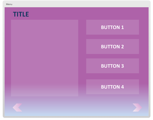
Then, I considered several basic screen layouts and sought about developing them, added some navigational elements (e.g. chevrons instead of the back/next button default), and tossed some placeholder layers in for the buttons.

The Result

The fruits of my labour were six screen layouts that you can customize any which way you choose – I tried to appeal to some of the most commonly encountered layouts, so hopefully they will address your template needs. Below, you will see a screenshot of one of the layouts included, and you will be provided with a link to the demo and the downloadable .story file. Go forth, spread the cheer of Pantone’s colour of the year!

Screen Shot 2014-08-28 at 9.23.53 AM

Click here to view a demo of the full Radiant Orchid template.

Click here to download the full Radiant Orchid .story file for Articulate Storyline.


1 Comment Filed Under: Instructional Design Tagged: E-Learning Challenge

E-Learning Challenge #48: Storyboard Templates for E-Learning

August 25, 2014

This week’s e-learning challenge is an interesting one…one that is often glossed over in discussions, but which has also been discussed at length (if you look for it): Storyboard Templates! Hooray! I’ve chatted about storyboarding vs. rapid prototyping here and created a jaunty time-lapse demonstration of the development of a very basic storyboard template here (along with a downloadable template – wahoo!), but I’m going to go through David’s questions and maybe even include some downloadable sample templates. GET EXCITED!!!

The Concept

Share an example of your preferred storyboard template and answer the following questions:

  1. How do you define scripting, storyboarding, and prototyping? Which method do you prefer?
  2. Do you use different types of storyboards? When do you use each?
  3. How do you storyboard interactivity?
  4. What are your top three storyboard tips for new course creators?

The Method

First, I considered my storyboarding preferences and sifted through my hard drive to locate some samples. I realized that I had previously included my preferred storyboard template (and by preferred, I mean most commonly used and/or adapted for use) here.

Then, I considered each question and jotted down some note for each.

The Result

By clicking here, you can download my preferred/most commonly used and/or adapted for use storyboard template.

  1. How do you define scripting, storyboarding, and prototyping? Which method do you prefer?
    • I previously defined storyboarding and prototyping over here, so I won’t bore you with a re-ramble of that post.  As far as scripting goes, I would consider this to be including verbatim onscreen text, narration, and or media element scripts for other developers (and/or yourself as an organization tool). When scripting audio narration, I also would define aspects of the script to clarify the verbatim narration (e.g. pronunciation).
    • I prefer rapid prototyping overall, but find it most effective with smaller projects, requiring less sign off from other individuals. With larger courses/products, I prefer to storyboard in a Microsoft Word template as it’s much easier (and cost effective) to modify a Word document than a developed file.
  2. Do you use different types of storyboards? When do you use each?

    • I do you different types of storyboards, but it really depends on the clients needs. If they’re able to visualize the overall course based on a detailed Word storyboard, I’ll do that. If they need something more visual, I’ll develop a visual storyboard in Microsoft PowerPoint or Articulate Storyline. If a complex branching scenario is used, I’ll refer to a Word storyboard in a task analysis template (e.g. where each cause and effect task is branched out appropriately). If the client requires an Excel template, I’ll cringe and comply (and sob).
  3. How do you storyboard interactivity?
    • My typical method for storyboarding interactivity is to create detailed accounts (occasionally supplemented with mocked up visuals – for complicated media descriptions) of the media and interactivity to be included on that screen. This tends me be adequate, but sometimes clients (or Subject Matter Experts) need more of a visual, in which case, I’ll do a visual storyboard using PowerPoint and include descriptions of the interactions or mock them up as much as possible (using animation effects) to convey a similar look and feel of the end product.
  4. What are your top three storyboard tips for new course creators?
    1. BE CONCISE in your onscreen content – no one likes scrolling (too much).
    2. Ensure all aspects required for development are accounted for within the storyboard (e.g. navigation, introduction, conclusion screens, interactivity, audio script) – it’s good to have a one-stop-shop approach to your storyboard templates.
    3. Be as detailed as possible in your media descriptions; often times in larger organizations, the storyboard gets handed off to a media developer and then maybe a programmer, and you want to be as detailed as possible to avoid back and forth communication regarding elements. Doing this will save you time, money, and frustration. AND – everyone will be on the same page (e.g. the media developer can get added context for a screen by reading the onscreen text, and the programmer has a better understanding of how to program the media interactivity by reading the media description). All aboard!

Leave a Comment Filed Under: Instructional Design Tagged: E-Learning Challenge

  • « Go to Previous Page
  • Go to page 1
  • Interim pages omitted …
  • Go to page 4
  • Go to page 5
  • Go to page 6
  • Go to page 7
  • Go to page 8
  • Go to page 9
  • Go to Next Page »

Primary Sidebar

Meet Ashley

Ashley ChiassonI’m a Instructional Designer with over 15 years of professional experience, and have developed e-learning solutions for clients within the Defence, Post-Secondary Education, Health, and Sales sectors. For more about me, click here!

Want more Instructional Design tips & tricks?

Subscribe below to get them sent straight to your inbox!

Featured Posts

Getting Started

Building Your Portfolio

Learn the Essentials

Essentials of Instructional Design

Mastering Articulate Storyline


Mastering Articulate Storyline will teach you some advanced techniques to leverage your existing Storyline skills.
Check it out:
Packt Publishing | Amazon

Articulate Storyline Essentials


Articulate Storyline Essentials will hold your hand while you get up and running with Storyline!
Check it out:
Packt Publishing | Amazon

Awards

2019

2018

Footer

Looking for something?

AC link to home

Let’s connect

  • Email
  • Instagram
  • Twitter
  • Vimeo

© 2014–2025 Ashley Chiasson M. Ed.