Pantone announced that the 2014 colour of the year was Radiant Orchid. And how I feel about it? – What’s pretty for none is hideous to some. I’m sorry, Pantone. You dropped the ball on the colour for me this year. Purple is one of my very favourite colours, but this shade of purple is just acrid to me.
The Concept
This challenge was to create a ‘radiant’ template using Radiant Orchid as the colour palette of choice. I’m going to sound like I’m making excuses here, and I am. But, I truly struggled with creating this template because I found everything I created to just look so vile. However, perhaps some of you appreciate Radiant Orchid and will also appreciate these layout templates I developed – who knows?!
The Method
First, I checked out the colour and applied it as a background colour to one slide. I wasn’t a fan, but I had to move forward. I found adding a gradient helped a bit, so I did that and went with it.
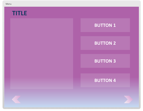
Then, I considered several basic screen layouts and sought about developing them, added some navigational elements (e.g. chevrons instead of the back/next button default), and tossed some placeholder layers in for the buttons.
The Result
The fruits of my labour were six screen layouts that you can customize any which way you choose – I tried to appeal to some of the most commonly encountered layouts, so hopefully they will address your template needs. Below, you will see a screenshot of one of the layouts included, and you will be provided with a link to the demo and the downloadable .story file. Go forth, spread the cheer of Pantone’s colour of the year!
Click here to view a demo of the full Radiant Orchid template.
Click here to download the full Radiant Orchid .story file for Articulate Storyline.


[…] colour of the year (you can see the blog write-up and challenge entry for Radiant Orchid by clicking here), I was actually excited about the new colour of the year, Marsala. I even fawned over the Sephora […]